The Brief
When I began working with Odawa Relations, the founders were building an advocacy agency for Indigenous and First Nations communities. They knew what they stood for and needed a visual identity that reflected it.
Initial Exploration
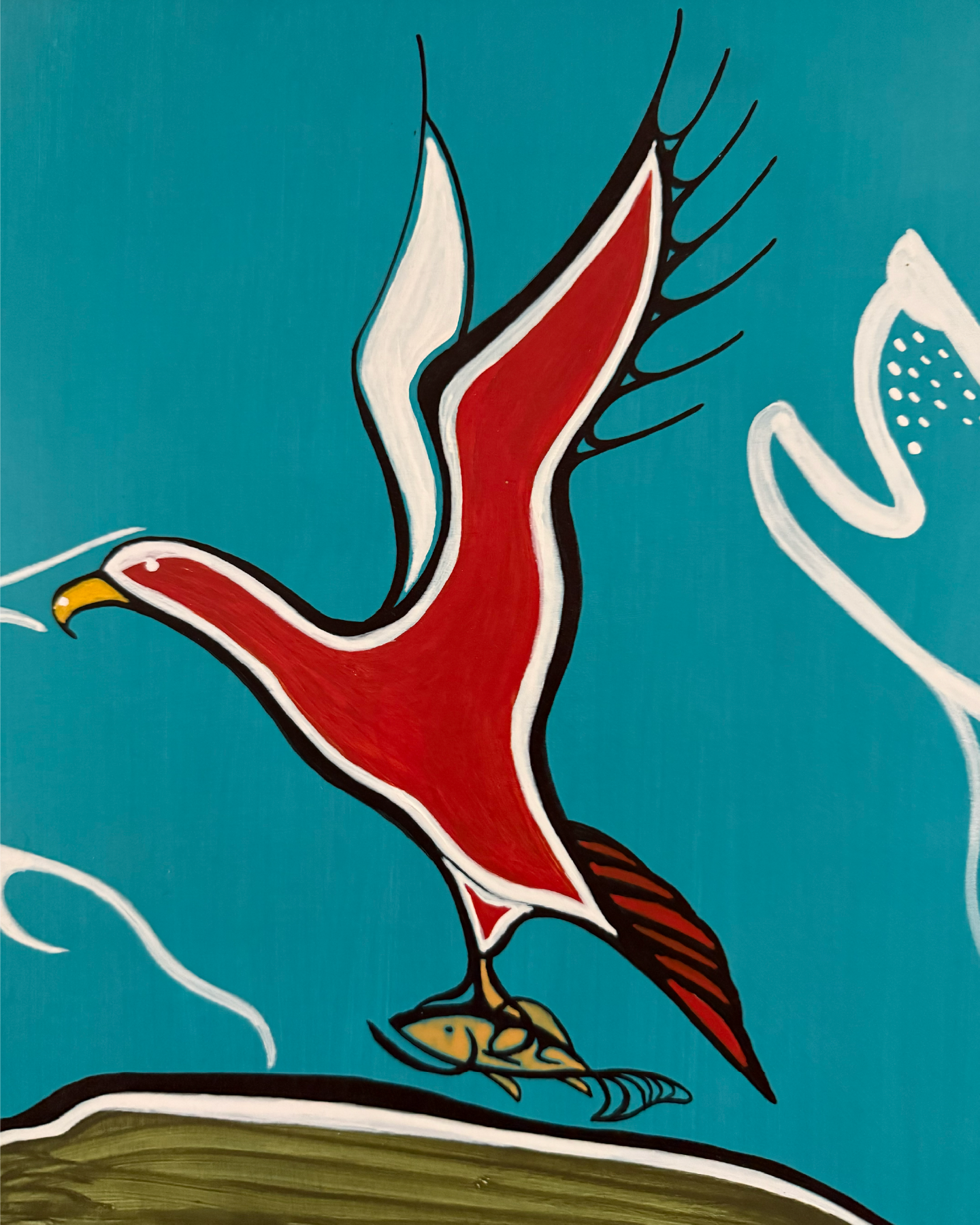
Our initial conversations centred on two references that held particular significance for the founders: Red Thunderbird and the Garden River bridge. The Thunderbird generated considerable enthusiasm early on, becoming the foundation for an initial series of concepts and a visual style study. With the creative direction approved, I began developing the identity around a stylized bird mark.
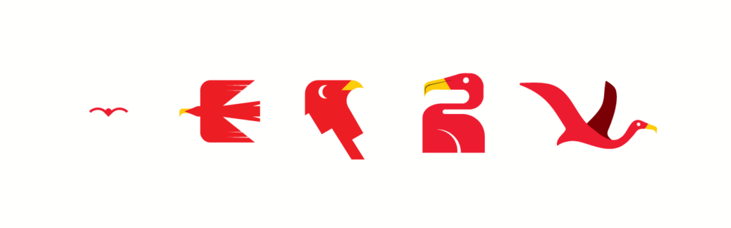
Presenting a variety of styles allowed me to probe further into their story, audience, and business goals.
Strategy
Reviewing comparable advocacy identities revealed an opportunity for bolder colour while grounding the visual language in Odawa Relations’ own story. I used red intentionally, and the range of early concepts helped clarify the founders’ audience, goals, and the story the identity needed to tell.

As the design approached completion, an unexpected constraint forced us to reconsider the direction. Although visually distinct, the proposed mark shared its subject matter with the identity of a former employer. To avoid that association, we agreed to move away from a literal bird altogether.
Reconsidering the Direction
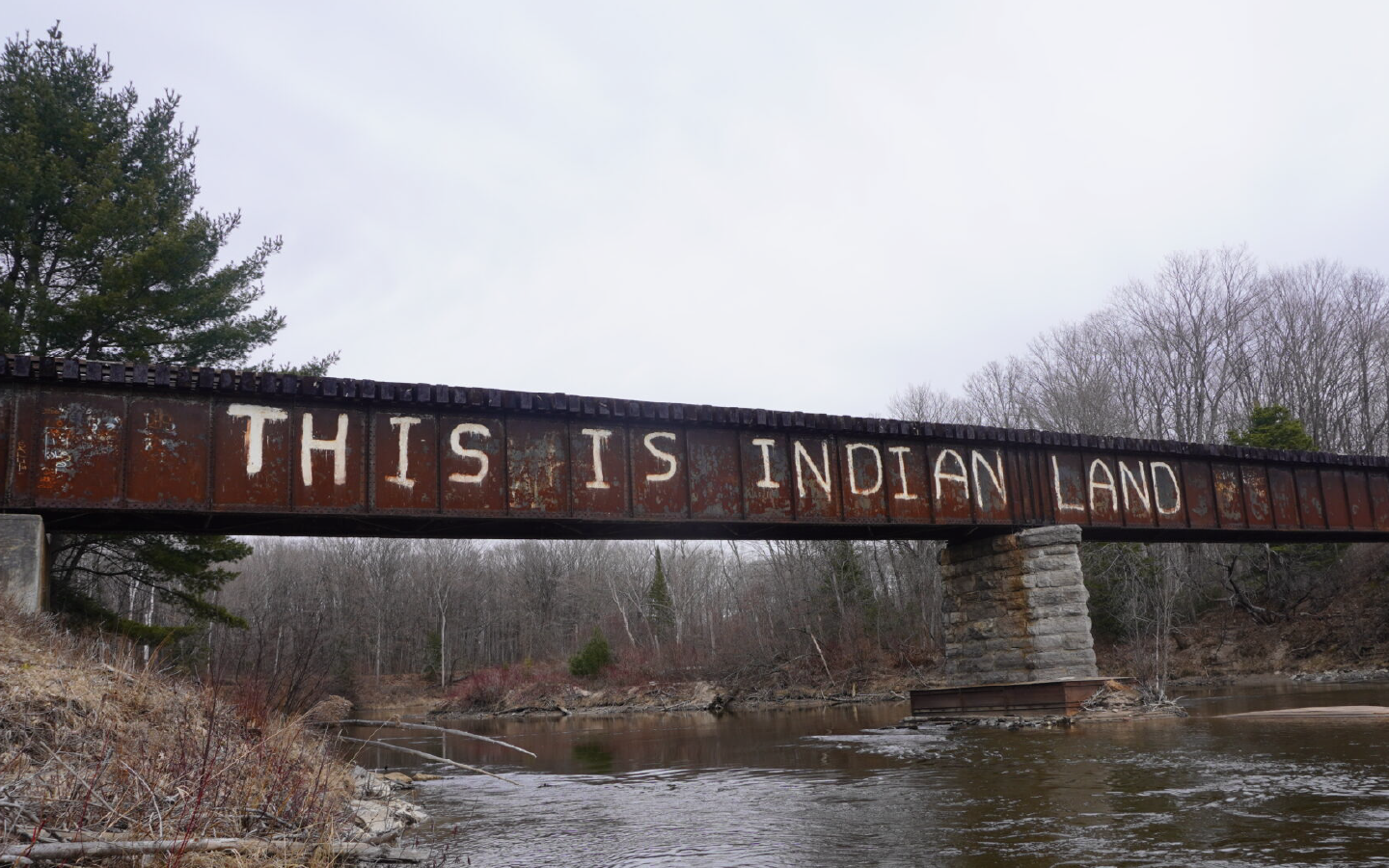
I returned to our discovery conversations, particularly the significance the founders placed on the Garden River bridge and the message it carries, both literally and symbolically. It had been an important part of their story from the outset, but now offered a different foundation for the identity.
White Irises
Ogawa Kazumasa
Garden River Bridge
Photograph taken by: Kierstin Williams
Finding the Final Form
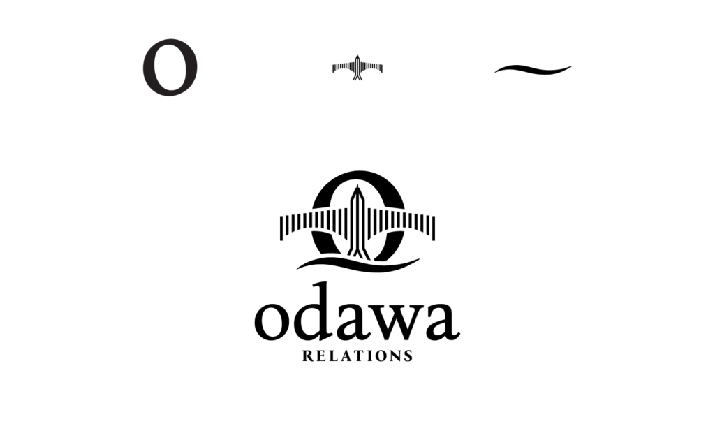
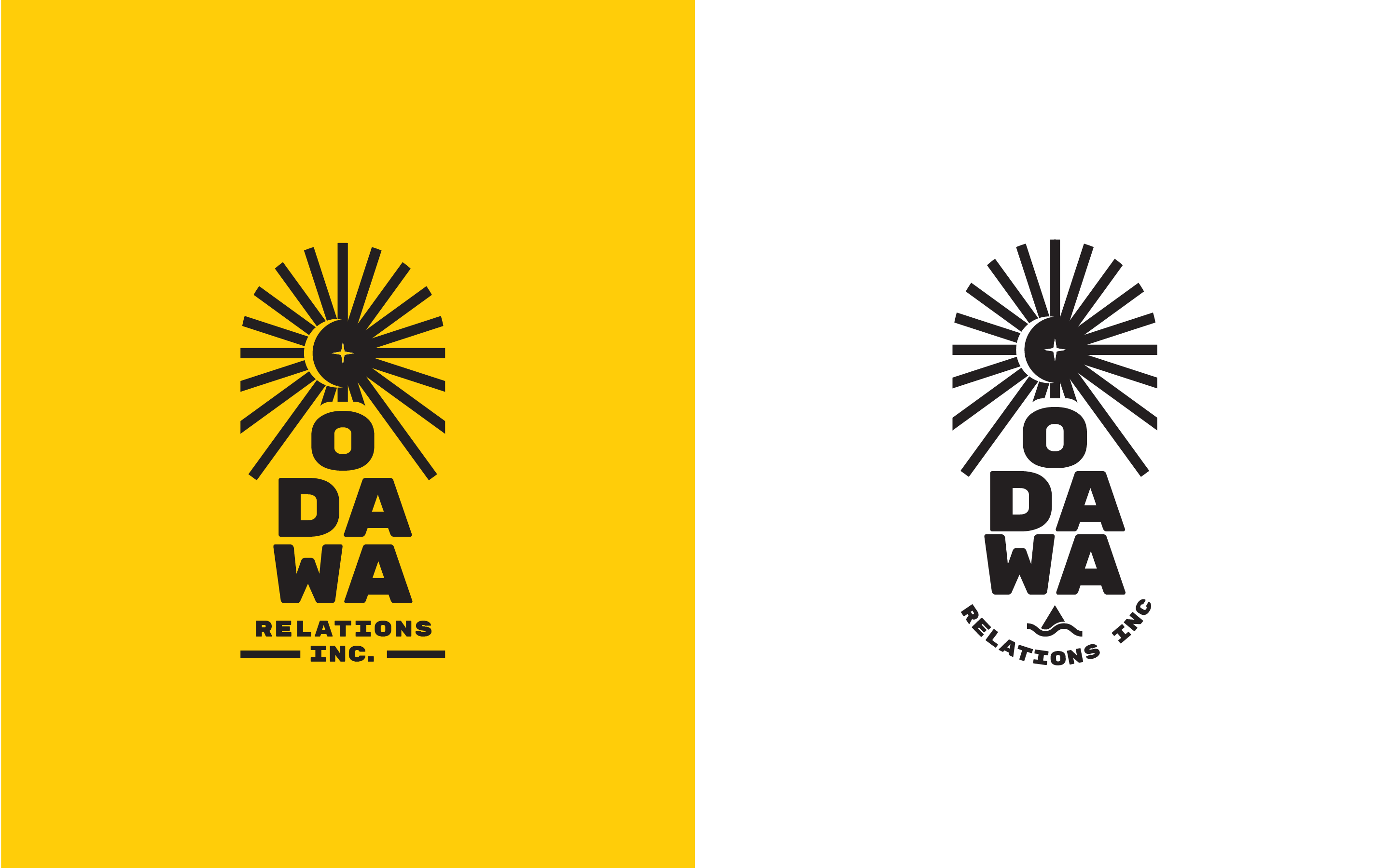
Working from the bridge’s structure, I reduced its defining features to a minimal arrangement of vertical bars. Through successive refinements, a subtle bird form began to emerge within the geometry. The resulting mark brought both references together without depicting either literally, preserving their significance while establishing a distinct visual identity for Odawa Relations.