Problem
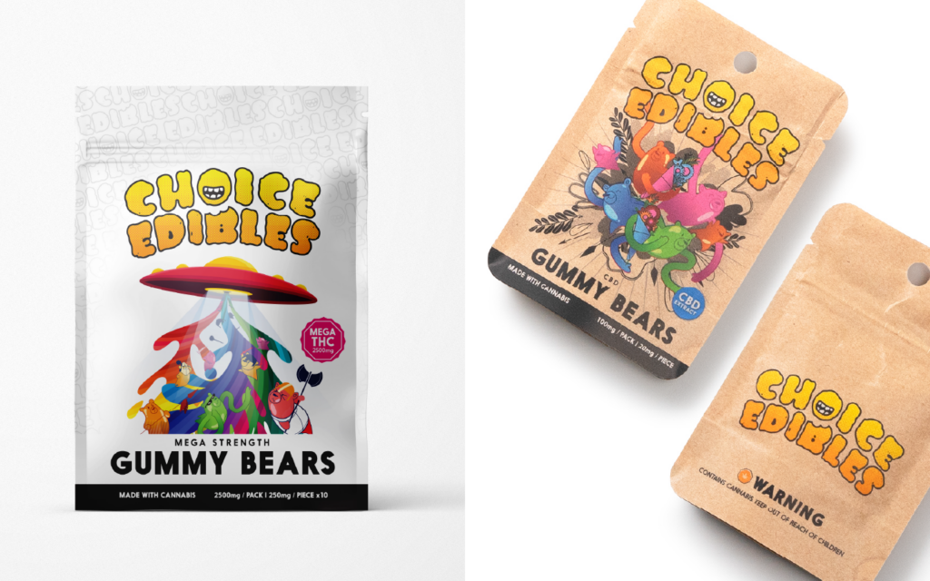
When this project began, Choice Edibles had three products: bears, drink mix and cotton candy, all packaged nearly identically, without a brand mark. The new packaging had to distinguish multiple products while remaining practical to produce, economical to order in volume, and consistent across the range.
Strategy
I reviewed competing brands and explored packaging materials with environmental impact and child safety requirements in mind. An initial concept featured a large die-cut mouth, centered on the package along with the choice edibles wordmark, intended to reveal the contents of each package. The mouth became the starting point for a playful wordmark.
My Leadership
I developed and refined the brand identity and packaging system over several years as the product range expanded. As order volumes increased, I recommended production and packaging equipment to support that growth. I also managed overseas production orders, ensuring materials, colours and print quality met the brand’s standards.
Creative Work
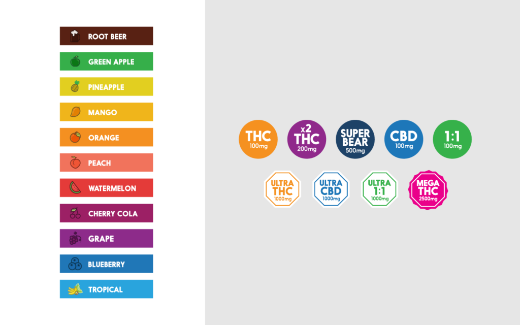
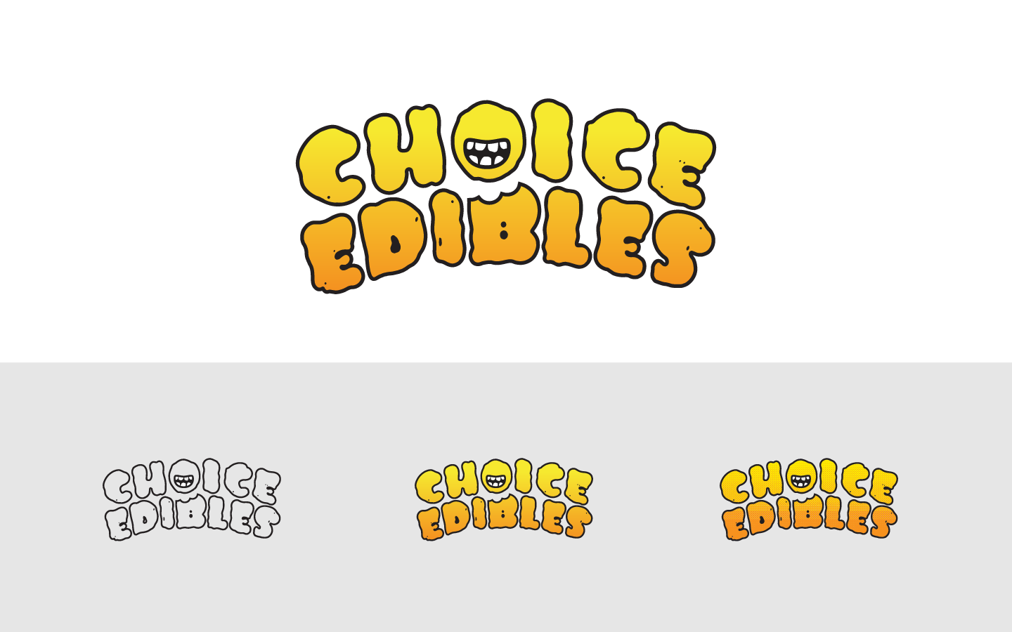
The finished wordmark uses rounded, irregular lettering, with the “O” becoming a smiling, toothy face. We selected a yellow-to-orange gradient that reproduced consistently in mass production. I extended the identity across packaging for chocolate bars, gummy bears, cotton candy, a drink mix, candy ropes, and hard candies. Colour coding, strength symbols, vector illustration, photography, and collage-style visuals helped distinguish the products within one recognizable system.
Result
The identity grew into a packaging system used across the product range. It was well received and supported recurring production orders of roughly one million packages per SKU every six months.